Why Are the Fonts So Large?
This is a question a designer friend asked me after I shared a portfolio I worked on. At first, I was puzzled by the query until it dawned on me that my experiences working with the Africa Albinism Network had subtly yet profoundly shaped my design philosophy. It was an enlightening moment that made me realize how much my understanding of inclusive design had evolved, something I hadn’t fully acknowledged before.
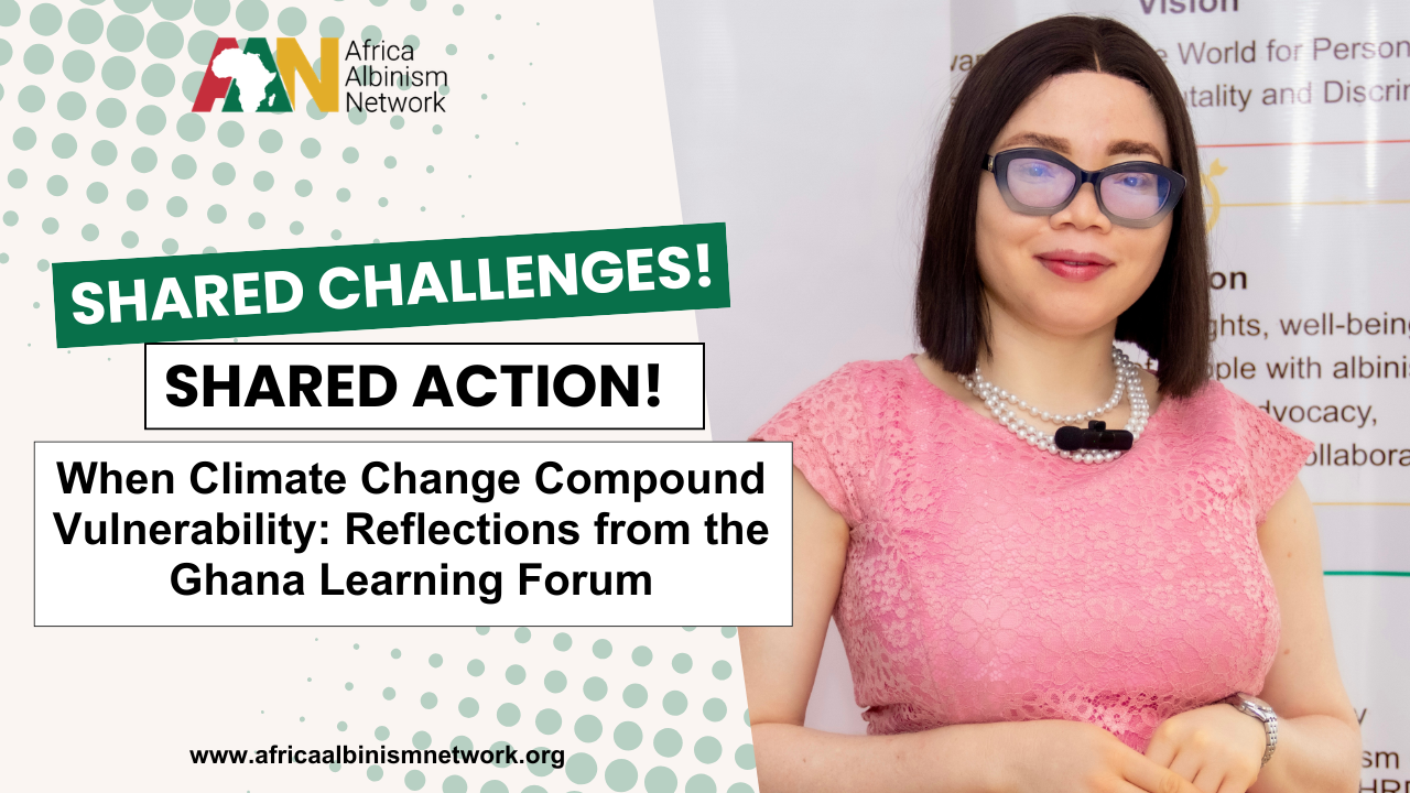
When I first began working with and for people with albinism, I began creating visually appealing designs that included and accommodated the low vision that often accompany albinism. These included the use of larger fonts, more contrast than I had ever considered, and no cursives ~ That’s a no-go area. When creatives like me design, we often focus on aesthetics, striving to create visually striking and engaging graphics. But inclusive design is more than just visual appeal—it’s about accessibility and ensuring that our creations are usable and enjoyable for everyone, including those with albinism and other visual impairments.
Albinism is a rare, non-contagious, genetically inherited condition that affects people regardless of race, ethnicity, or gender. It results from a significant deficit in melanin production and is characterized by the partial or complete absence of pigment in any or all of the skin, hair, and eyes.
Many individuals with albinism commonly experience visual impairments amounting to reduced visual acuity and difficulty reading smaller fonts; light sensitivity and difficulty perceiving contrast. This means that what might seem like a minor design detail can significantly improve usability and comfort for people with albinism.
Understanding Inclusive Design

At its core, inclusive design is about creating solutions for the broadest range of people. This means considering how people interact with visual content and making conscious decisions to accommodate diverse needs. Here are some fundamental principles of inclusive design that can be particularly beneficial for people with albinism:
- Prioritize Legibility: Use larger fonts and high-contrast text to ensure that content is readable for those with low vision. The contrast between text and background should be strong enough to facilitate easy reading. Dark text on a light background is generally more legible, but always test your choices with real users.
- Avoid Glare and Flashing Elements: Designs that include bright, flashing, or glaring elements can be particularly challenging for people with albinism, who may have heightened sensitivity to light. Opt for designs that minimize such elements or provide user controls to adjust brightness and contrast.
- Offer Customization Options: Where possible, allow users to adjust text size, color schemes, and other visual elements to suit their preferences and needs. This can significantly improve the accessibility and enjoyment of your design.
- Test with Real Users: Always involve people with albinism in your design testing process. Their feedback is invaluable in understanding how your design performs in real-world conditions and how it can be improved.
- Consider other accessibility needs beyond albinism: For example, provide descriptions of images to make your images accessible to people who are blind and use screen readers to navigate images. Also, consider reviewing this article in the Disability Debrief for further information on universal accessibility.
The Impact of Inclusive Design
The journey toward making designs inclusive isn’t just about checking an accessibility box —it’s about creating a more equitable digital landscape. When we design with inclusion in mind, we contribute to a world where everyone can access and benefit from digital content without accessibility being an afterthought.
My work at the Africa Albinism Network has highlighted the importance of this approach. It reminds me that even the smallest design choices can profoundly impact someone’s ability to engage with content. By embracing inclusive design principles, we not only enhance the user experience but also demonstrate respect for the diverse needs of all users.
Ultimately, my friend’s question about font sizes was more than a critique; it was a call to action. It challenged me to think deeper about the implications of my design choices and to strive for greater inclusion in all my work. As a creative designer, I have the power to shape the digital world in ways that are welcoming and accessible to everyone. I personally embrace this responsibility to serve everyone by making all my designs accessible.


